Vision ergonomics in office
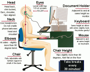

Many people have suffered discomfort in their eyes because of wrong eye position & distance while working on the computer, but there some tips to avoid them . is :
- Eye to screen distance
- Locate the monitor at least 25 inch away from the eyes
Hold your finger at arm’s length. Bring it slowly towards your nose, following it with your eyes. Notice that the closer your finger comes, the more eyestrain you feel
One of the main reasons for computer-related eyestrain is the closeness of the monitor. It seems easy to understand that, if having the monitor too close contributes to the problem, one of the solutions is to place it farther away. When viewing close objects the eyes must both accommodate and converge. Accommodation is when the eyes change focus to look at something close. Convergence is when the eyes turn inward towards the nose to prevent double vision. The farther away the object of view, the less strain there is on both accommodation and convergence (Fisher 1977; Collins 1975). Reducing those stresses will reduce the likelihood of eyestrain.
- How close is too close?
So how close is too close? It is difficult to set an exact limit for a minimum viewing distance. Continued viewing closer than the resting point of vergence contributes to eyestrain (Owens and Wolf Kelly 1987). The resting point of vergence (RPV) is the distance at which the eyes converge when there is nothing to look at, such as in total darkness. It varies among individuals, but averages about 45″ when looking straight ahead and 35″ with a 30° downward gaze angle. Viewing objects farther than the RPV has not been found to cause any problems.
- What is important to understand is that farther is better (at least up to the RPV). If you can read the monitor, it is not too far away. If you can’t read the characters, it’s usually better to make them larger than to bring the monitor closer.
- Distance to monitor and hard copy
- Early recommendations said that the monitor and document had to be at the same distance. But to do that often means moving the monitor closer. Research by Jaschinski-Kruza (1990) found that eyestrain was not increased when the monitor and document distance differed. In fact, users preferred that the monitor be farther away.
- For data entry tasks that require rapid shifts from screen to document, locating the screen and document at similar distances can reduce the time lag encountered when changing accommodation. In this case enlarging the document is the best solution. The larger letters will then be visible at the greater viewing distance.
- Performance
- Jaschinski-Kruza (1988) compared work performance with subjects working at viewing distances of 20″ and 40″. The task was to find mistakes in a database and he found better performance at the 40″ distance. The character heights were doubled as the viewing distance doubled. In another part of the study he increased viewing distance without making the characters larger and performance suffered. To take advantage of the productivity increases with farther viewing distance, you must ensure that the user can easily read both the screen and the hard copy.
- Vertical monitor location
- Locate the entire viewing area of the monitor between 15° and 50° below horizontal eye level.
- To see the effect of gaze angle on accommodation, hold a business card at arm’s length and at eye level. Slowly bring it towards you until the letters start to blur. Without moving your head, slowly lower the card in an arc, keeping it the same distance from your eyes. You will see the letters come into focus. Your eyes have improved their ability to accommodate simply by lowering their gaze angle. Presbyopes (persons over 40 who are losing their ability to view close objects) often make use of this phenomena when they misplace their reading glasses. They hold reading material at arm’s length and then tip their head back to improve their ability to accommodate.
- To see the effect of gaze angle on your ability to converge, try this next demonstration. With your head erect, hold a pen at arm’s length and at belt level. Gradually bring it towards your nose, following it with your eyes until you can no longer converge accurately and you see two pens. Without moving your head, try the same test at eye level. Again, notice the distance at which you can no longer converge. Now bring the pen in from an upward gaze angle. As you can see and feel, your eyes converge more easily with a downward gaze angle.
- The old guidelines that recommended that the monitor be placed at eye level were based in part on the belief that the resting position of the eyes (considered to be the most comfortable gaze angle) is 15° below the horizontal (Morgan, Cook, Chapanis, and Lund 1963). New evidence (and some that has been around for a while) shows that, while the eyes might be most comfortable with a 15° gaze angle when looking at distant objects, for close objects they prefer a much more downward gaze angle (Kroemer 1997). Figure 1 shows the optimum position for the most important visual display, 20 – 50° below the horizontal line of sight, according to the International Standards Organization (ISO 1998).
- As we saw from the above demonstrations, a downward gaze angle improves our ability to accommodate and converge. Ripple (1952) found that subjects over age 42 increased their ability to accommodate by an average of 25.5% by directing their eyes downward in the “usual reading position.” Krimsky (1948) observed, “when looking upwards, the eyes tend to diverge…and when they look down, the effort to converge is much easier.” Tyrell and Leibowitz (1990) found that a low gaze angle resulted in reduced headaches and eyestrain.
- Many computer users experience dry eyes. Tsubota and Nakamori (1993) found that lower monitor placement exposes less of the eyeball to the atmosphere and reduces the rate of tear evaporation. This keeps the eyes more moist and reduces the risk of Dry Eye Syndrome.
- Neck posture
- Lower monitor placement can increase the acceptable options that users have for neck movement (Ankrum and Nemeth 1995). Eye-level monitors allow the head and neck to assume only one posture that is both visually and posturally comfortable.
- It is uncomfortable to maintain the same posture for an extended period of time. When users tire of the head-erect posture, the acceptable alternative postures with an eye-level monitor are limited. Flexing the neck is one alternative, but that results in the user looking out of the top of their eyes. While bending the neck downward may be physically comfortable (as long as you are not forced to hold it in a fixed position), looking out of the top of your eyes at close objects is extremely uncomfortable. People will just not do it for any length of time.
- Neck extension and forward head posture, while acceptable for the visual system, have been associated with both discomfort and disease (Kumar 1994; McKinnon 1994). With a low monitor position you can hold your head erect and look downward. When that posture becomes tiring, as eventually it will, a low monitor will allow you to alternate among a wide range of flexed neck postures that allow good visual performance and will not increase postural discomfort (as long as you don’t hold any particular posture for a long time).
- Many “ergonomic” guidelines include drawings that show a computer user with arms, torso, thighs and legs at 90° angles and the head perfectly erect. And, of course, the feet are “flat on the floor.” This is the “correct posture.” Generally users try it for a few minutes and reject it because it’s too uncomfortable. One theory has it that the reason you see drawings, and not models, depicting this “ideal” posture is that they can’t pay models enough to sit that long in such an awkward posture!
- Voluntary postural changes should be encouraged. Even alternative postures that look awkward may be ok if they are used for short-term relief from the discomfort caused by sustained, fixed postures. Stretching exercises require awkward postures and are often recommended by the same guidebooks that mandate the “correct” posture while working. As Paul (1997) points out, “The best posture is the next posture.” Whatever posture we are in, we will be most likely be better off in the one we assume next.
- Although most ergonomists agree that a low monitor is better for the visual system, the question has been “What happens to the neck and upper back?” Two recent studies have addressed that question. Turville and colleagues (1998) compared monitor locations with the center of the screen at 15° and 40° below horizontal. They compared the average (mean) muscle activity for 10 sets of neck and upper back muscles. The recommended limit for mean muscle activity is 10-14% maximum voluntary contraction (MVC) (Jonsson 1978). (MVC is the maximum muscle effort that can be voluntary exerted by the subject.) Although the 40° placement had higher readings than the 15° placement, all were much lower than the recommended limit. The highest was 6.8%. For the trapezius, the muscle most often associate with cumulative trauma disorders, the activity averaged an extremely low 2.2% MVC for the 15° and 2.0% MVC for the 40° conditions.
- Unfortunately, Turville et al., mistakenly compared their findings to Jonsson’s (1978) recommendation of a 2-5% MVC limit for static load. (The static load level is the lowest level of activity that occurs in the muscle during the work period, defined as the 10th percentile.) Because they reported the “mean” activity level, they should have compared it to Jonsson’s recommendation for mean muscle activity, which is 10-14% MVC. They erroneously concluded that the muscle activity while working in the low monitor condition was higher than the limit, when it actually was lower.
- Sommerich and colleagues (1998) compared monitor positions with the center of the monitor at eye level, and 17.5° and 35° below eye level. All of the conditions resulted in mean EMG levels of below 4% MVC, well below the recommended limit of 10-14%.
- Sommerich et al., (1998) also examined work performance. They found a 10% improvement in productivity when the center of the monitor was changed from eye level to 35° below eye level. Performance was measured as the number of bibliographic references the subjects were able to format in the allowed time.
- Computer work is near work. Many authors have noted that computer work differs from other near work in that most near work is done with a downward gaze angle, and computer work is done at a horizontal gaze angle. Instead of locating the monitor at a viewing angle similar to that of other near work, they often recommend special “computer” glasses. This represents the view that ergonomics means adapting the worker to the work environment. It is actually the other way around, the task of ergonomics is to adapt the work environment to the worker
MONITOR TILT
- Tilt the monitor back so that the top is slightly farther away from the eyes than the bottom.
Notice how you hold a magazine. Most likely you tilt it away from you at the top. While you are reading, rotate the magazine so that the top comes closer to you than the bottom. Keep rotating. The more you rotate the top towards you, the more uncomfortable it becomes to read.
When we look at the world, objects in the upper part of our peripheral vision are generally farther away than the point we are looking at, and objects in the lower part of our peripheral vision are usually closer. As a result, our visual system has developed to perform best when the visual plane tilts away from us at the top.
Tilting a monitor down, as is sometimes done to avoid glare, is opposite of the demonstrated capabilities of the visual system. In a comparison of monitor tilts, Ankrum and Nemeth (1996) found that tilting the monitor downward led to increased visual and postural discomfort when compared to a monitor tilted back. The most striking difference was in neck discomfort. The condition with the monitor low and tipped back led to the least increase in neck discomfort. Locating the monitor low and with the top tipped forward was the worst condition.
LIGHTING
- Ceiling suspended, indirect lighting. Control outside light with blinds and shades. Keep ambient light levels low and supplement with task lighting.
In an office of any size, the best solution for glare and reflections on the screen, as well as for overall visual performance, is ceiling suspended, indirect lighting. This is sometimes referred to as “uplighting.” The underside of the lamps should be the same color as the ceiling. Wall mounted sconces may also be appropriate in certain instances. Because some tasks and workers require more light than others, it is best to keep the overall light level low and allow workers to supplement it with individually controlled task lights.
Understanding a little bit about the principles of lighting can help you improve just about any office environment. First we have to understand what we are trying to accomplish. When evaluating a monitor, high contrast is desirable. You want the letters to stand out from the background.
When evaluating what is reflected from the screen, it is the opposite: contrast is the enemy. Contrast reflected from the screen competes for the user’s attention with the contrast on the screen. In some cases this can be an irritation, but in others it can make sections of the screen impossible to read.
Aside from absolute brightness, a big problem with direct ceiling lights is that they provide a high contrast with the rest of the ceiling. That contrast can reflect onto the screen. Many guidelines mistakenly specify only a luminance (brightness) value for ceilings and walls. While absolute intensity is important (a bright light reflecting off the screen will always cause problems), reducing the contrast is much more critical. Interrupting the ceiling with patches of bright light almost guarantees competing reflections on the screen.
With small office areas, it may be possible to reposition desks, or remove or reposition individual glare sources. However, this can become unwieldy for large areas. Repositioning a lamp may just transfer the problem to another workstation.
In many instances it is possible to retrofit small cube parabolic or paracube lenses to replace other types of lenses. If the cutoff angle (the angle beyond which the bulb cannot be seen) is acceptable, reflections of the light source from the screen will be eliminated. In other instances it may be possible to install shields or screens to reduce or eliminate the reflected contrast.
Reorienting the screen can help in some instances. But, as we discussed earlier, it should not be tipped down. Hoods can be effective, as can removing bulbs. Task lights can supplement lower levels of ambient lighting. Anti-glare screens have been effective in certain instances, but should be evaluated before purchase. Some anti-glare screens reduce glare by 99%, but even that may not be enough for a very bright source.
Remember, because the front of the screen is glass, something is going to be reflected from it. The goal is to reduce the contrast in those reflections. An indirect-direct combination will not work because it still creates high contrast.
Perhaps the most famous study regarding performance and lighting conditions was done at Western Electric’s Hawthorne Plant in Chicago (Mayo 1933). The researchers found that when they increased light level, productivity increased. They also found that when they decreased the light level, productivity still increased. In fact, no matter how they changed the lighting, productivity continued to increase.
The term “The Hawthorne Effect” is now used to refer to the principle that making any change in a workplace can improve short-term performance. The improvement results from just “paying attention” to the workers.
Perhaps as a result of the Hawthorne experience, few field studies have measured performance under different lighting conditions. Hedge et al., (1995) found an increase in self-reported productivity of 2-3% for lensed-indirect lighting when compared with parabolic downlighting.
It’s apparent that strong reflections in a screen reduce the ability to see the details on the screen. And if you can’t see the details, productivity will suffer. Properly installed indirect lighting can eliminate glare as a performance-robbing factor.
Most recommendations for office lighting are full of numbers such as “Illuminance levels between 200-500 lux.” Lighting designers often point to a set of measurements to show that the lighting design meets the specifications.
The primary function of light in the office is to support work. The ultimate criteria for a successful office lighting solution is how well it facilitates productivity and user satisfaction. No matter how esthetically pleasing or how well it conforms to a set of quantitative values, if a lighting design does not support the work, it has failed.
Rea (1991) offers an excellent discussion of VDT lighting.
SCREEN COLORS
- Screen colors: dark letters on a light background.
With the monitor off, look at your reflection in the screen. Now turn the monitor on and select a Windows-type background, (black letters on a white background). Notice that you cannot see your reflection as well.
Contrast is simply the difference in brightness between two images. With a white background, we reduce the difference in contrast between the screen and what is reflected off of it.
Negative screen contrast (black letters/white background) can reduce reflected images, as we saw with the demonstration. A white background also reduces the luminance (brightness) difference between the screen and the surrounding background of a normally lighted office. That makes it easier on your eyes.
Most early monitor screens had a black background with white, green or amber characters. Although white backgrounds were possible, the low quality of the monitors meant that the screen would flicker noticeably. Although newer technology has reduced the necessity, there are still many software programs with dark backgrounds.
Performance
Bauer and Cavonius (1980) found a lower error rate, with dark letters on a white background. Snyder and his colleagues (1990) also compared black and white backgrounds. Eight out of ten subjects increased their performance by using dark letters on a light background. The improvements ranged from a low of 2.0% to a high of 31.6%. The tasks were visual search and proofreading.
some tips for who use glasses
1. use anti glare screen protection
2. use a special glasses for computer
